Post written by Jared Banks in 2015
This is the Eighth post in my extremely long series on Pens and Pen Sets in Archicad. If you need a refresher, here are the other posts:
- Pen Sets, Part One
- Pen Sets, Part Two
- Pen Sets, Part Three
- Pen Sets, Part Four
- Pen Sets, Part Six
- Pen Sets, Part Seven
This post is essentially bonus thoughts to Part Seven, and a lead into at least two forthcoming posts on how to name things in Archicad. What follows will thus be both a wrap up of the previous post on colors and line weights and a nice introduction to the topic of nomenclature in Archicad.
When I rebuilt my template for Archicad 18, I completely redid my Pens and Pen Sets. If you’ve already read Part Seven, you know the grand rethinking that I did. The other major change for me is that I completely reworked the naming conventions of my Pen Sets. When I first started customizing Pen Sets (back in Archicad 10), each Pen Set included the name of the company I was working for—that way my coworkers would know that these Pen Sets were for them. When I left that job and started thinking about the community at large, I dropped the company specific name and went with something more general: “standard, color” or “plans, black”. While that naming technique got rid of unnecessary company branding, it still wasn’t that great. It still had waste. What does “standard” mean, after all? For the latest iteration of my template, I’ve renamed all the Pen Sets to very clearly state what makes them special.
Pen Set names fall under the unique category of things in Archicad that will never show up in any documentation. Pen Sets are purely internal Attributes. They won’t appear on a drawing or schedule or exported as part of a digital file. Their naming conventions should therefore be something that is focused on the Archicad user. Here is the complete list of Pen Sets from my template:
0 Half Tone
0 Schematic
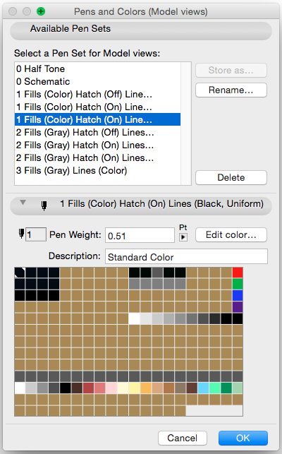
1 Fills (Color) Hatch (Off) Lines (Black)
1 Fills (Color) Hatch (On) Lines (Black)
1 Fills (Color) Hatch (On) Lines (Black, Uniform)
2 Fills (Gray) Hatch (Off) Lines (Black)
2 Fills (Gray) Hatch (On) Lines (Black)
2 Fills (Gray) Hatch (On) Lines (Black, Uniform)
3 Fills (Gray) Lines (Color)
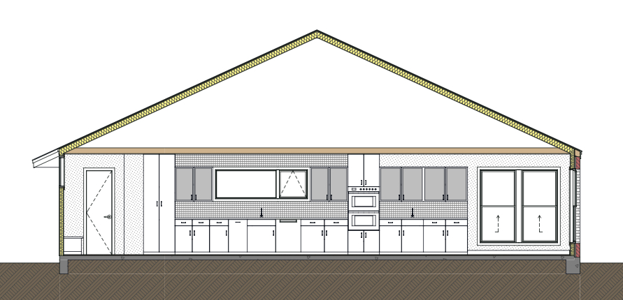
You’ll notice I’ve broken the Pen Sets down into groups by number. Each number corresponds to a group of Pen Sets that work together. So if you want to work with Group 1, you don’t need Group 2. If you want to work with Group 2, you don’t need Group 1. The 0 Pen Sets are my universal Pen Sets for half tone and schematic drawings. I’ve talked about them in the past (Intelligent Dumbing and Pen Sets, Part Three) and the logic behind them hasn’t changed. Pen Set Groups 2 and 3 likewise correspond to old methodologies that have evolved over the years, as laid out in Pen Sets Parts 1 through 6. Pen Set Group 2 are streamlined versions of more traditional Pen Sets for printing in black, white, and gray scale. Group 3 is a safety net, for when you want to see color = line weight. I talked about that at the end of Pen Sets, Part Seven. It’s scary to leave color equals line weight behind, but with a good template you can trust that things will be okay. And that’s also what True Line Weight via the context menu is for (remember if you hold down the space bar before right clicking, Quick Selection will be temporarily suspended and you won’t accidentally click on a Fill, Slab, Roof, etc. when what you really want is the Context Menu to quickly turn on/off True Line Weight). If you download my template to check out my logic, view the 3 Fills (Gray) Lines (Color) Pen Set the same way you use the True Line Weight option—as something you typically don’t use, but do turn on occasionally to check that everything is okay.
Naming Convention Breakdown
Now lets look at each part of the Pen Set names and examine what they are doing.
Numbers: The numbers are a way to group my Pen Sets. As discussed above, each group of numbers works together. So the 1’s are a group and the 2’s are another, separate group. The numbers are a simple way to have the Pen Sets ordered the way I want, and makes switching between Pen Sets visually easier (the 1st 1 Pen Set and the 1st 2 Pen Set are analogs).
Fills: Are the Fills in color or gray scale? I’m shortening Gray Scale to Gray. I think that’s acceptable.
Hatch: Are the hatch patterns in Fills visible or hidden? Some Fills we always want to see with their patterns on, others only at a higher scale. In my previous iteration, this was handled with four pens for Always on, Plan Only, Section and Detail, and Detail only. I’ve condensed this to either Always on or On/Off. I found that all the previous complexity was a bit overkill. Of course if you need further differentiation, my Pen Sets have the space for that. But don’t bother. Always On and On/Off are plenty, especially when you have color adding to the clarity of Fills. You can do more with less.
Lines: Are they black or in color? The color is really just for on screen visualization. But I guarantee you’ll stop using that once you spend all your time looking at colored hatches. Line weights become less important and the colored pens become a distraction. Also in this part of the Pen Set name is whether the majority of the Pens have a uniform thickness or not. Currently I use line weights for plans and details. For sections and elevations I use a uniform line weight. Color Fills support this and it looks awesome.
Next Steps
The one gripe I have with my Pen Set naming conventions is that the entire text doesn’t show up in the Pens and Colors Dialog box. Nor does it show up completely in the Quick Options or View Settings if you have the widths of those minimized. You can see the full name if you click, but it’s not 100% visually available. I can live with this, but it’s not perfect. I guess I could add a .X after the number to clarify the differences, but then that creates a secret language which others might not know. Better to keep it simple. Also part of me thinks I could get rid of all the times I label the Pen Sets “Lines (black)”, as this is the default. But I enjoy the clarity of it. It shows what it is in the name and also highlights to someone not familiar with my template that lines being black is a critical aspect of the Pen Set.
What are your thoughts? How do you decide what to call your Pen Sets? Does it bother you that my Pen Sets intentionally have no relation to scale or drawing type; that all my Pen Sets are about different graphic display, just as my layering system ignores scale as a factor for Layer Combinations and Layers?
Are you following Graphisoft North America on Twitter? Click Here to keep track of all the latest Archicad News in North America (and beyond).
You might also like:
More Articles:
Archicad
Customer Stories
Education
Industry News
Tips, Resources + Downloads
Webinar Recordings