Post written by Jared Banks in 2014
Once upon a time you looked at a pen, saw a color, and knew the thickness of the line that the pen would draw. Orange was thicker than green, which was thicker than red. You might know that orange = 1.2 mm or that gray = .35 mm, but that didn’t really matter. You knew what pen to use for what line you wanted to draw. The color on the pen was a shortcut for thickness and in the end what was being drawn was a black line of a given width.
Once upon a time this concept was translated to the world of computers. The color of the ring on the pen became the color of the line on the screen because there was just the mouse or the keys on the keyboard. An orange ringed pen became an orange line on the screen and a pen with red on it became a red line on the screen. The colors might have shifted slightly to accommodate limitations of the monitor or to better contrast with the background color, but the shorthand remained.
Color equals thickness and in the end what is printed is a black line. For various reasons it makes sense to view a thin line on screen rather than a fat line, so color equals thickness also solves the issue of lines close together blurring when not zoomed in. Printing technology, screen technology, and the general feelings of the AEC industry support this long running standard. Colors are shortcuts and drafters’ tricks. Black (and maybe gray) lines are for clients, job sites, and physical documentation.
Let’s End That
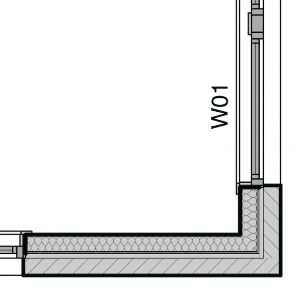
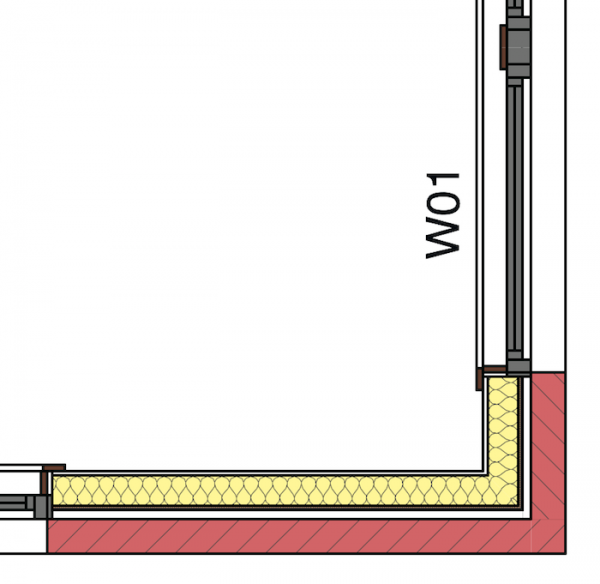
Which of these two images tells a better story? Which of these two images is self explanatory? Which allows you to more confidentially know what material the windows are made of, what the outer skin of the wall is, what the interior trim is made of, whether or not the wall has an air space… All of that information is already embedded in the model. It’s easy for anyone with access to the digital model to find out: the Composite Wall is made up of a number of Building Materials, which are all digital approximations of things like brick, air space, gypsum board, plywood sheathing, etc. But that information is all dumbed down for output. All that data is made harder to understand when it’s shared.
We don’t use Rapidographs anymore for drafting, and many of the graduates coming out of school these days have probably never even used them to begin with, so why do we still live in that world? No more. It’s time to go full color. If we see gray on a plan, why not have that mean concrete? If we see yellow, why not have that be insulation? And wood’s brown, why not show it as such? I do think there is continued value to maintain conventions like hatch patterns. Concrete should still look like a concrete hatch, but we can further reinforce that information through color.
Things Have Changed
One of the reasons architects never did full color drawings was because it was impractical: the number of tools needed (colored pencils, markers, bottles of paint, brushes, etc.) and the extra amount of time required (adding tone to every cut element or surface shown) made it an impossible task. Sure we could do colored renderings (ei, project specific artwork), but manually doing ten, twenty, or a hundred colored details would be an astronomical task. This burden began with pre-computer drafting and continued until 2013 when Archicad 17 was released—because Building Materials then allowed us to automate this process, making it no harder to produce color drawings than black and white ones.
We can now connect Fills and Pens to individual Building Materials, allowing us to control the representation of Building Materials globally (whether that Building Material is part of a 3D element or drawn as a 2D fill). Fills in Archicad have both a foreground fill pen and a background fill pen. Historically this has been treated as how thick do you want the lines (foreground) and do you want the background of the fill to be transparent, white, black, or maybe gray. For the first nearly thirty years of Archicad’s existence this was a fine status quo. Building Materials offer a new solution by turning foreground and background fill pens into a sub-attribute of the Building Material super attribute. Because of Building Materials, fill pens switch from being set at the element level to the global level.
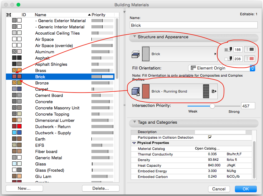
Each Building Material can be setup to display as a particular color, based on its Fill. In the example below, my Brick Building Material—in addition to having the Brick – Running Bond Surface for 3D visualization—has the Brick Fill with the associated pen 188 for foreground and pen 208 for background. The result is that everywhere the Brick Building Material shows up, it shows as red with gray lines, as in the image above. If you look closely at the list of Building Materials on the left in the image below, you’ll see that I’ve gone through and aligned the Surface color and the 2D color to match—thus depending the connection between 2D and 3D representation, and between the documents and the final built project.
How to do This
To assign colors to all your Building Materials (or Fills in Objects), you need a set of colors to work with. Here’s what one of my Pen Sets looks like:
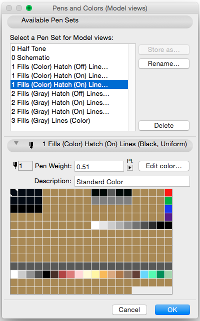
There are a number of things going on (hint: the red, green, blue, and purple pens on the right always stay in color, see Pen Sets, Part Five and Pen Sets, Part One). But what we want to look at are those two rows at the bottom (pens 181-200 and 201-220). Pens 181-200 are used to turn on or off hatches, as discussed in Pen Sets, Part Four. When I want hatches off, pens 181-200 = pens 201-220; so for instance both pens 181 & 201 would be white in hatches off and pens 200 and 220 would both be mint green. That gives great on/off control for hatches, but isn’t really anything new (see Intelligent Dumbing).
What is a big evolution for my work is that those two rows of pens are dedicated for Fills and are 100% graphic. There isn’t a Fill pen for wood or metal or brick or stone. There are just a series of colors to choose from to help suggest materiality. The same pen number might be used for concrete and stainless steel, if both can be shown as the same color gray. For solid hatches, I’ve even found that using a 25% fill with say Pen 213 as the foreground and Pen 214 as the background gives me an even larger selection of browns.
Having run a number of tests (and currently working with these pens on a few projects), I’ve found that these twenty pens are more than adequate to add color to all the sectional information in my work. I have left space to add more pens in case I find that I need more colors, but I really doubt I’ll ever need them. What is more likely is that I’ll swap out a color I find unnecessary for one I do need.
None of us are actually ready to listen to me
My new Template has a lot of Pen Sets. Too many. There are nine. But that’s because I don’t want to drag everyone into the future if they really don’t want to. Or if they come across a situation (expensive printing, resistant bosses, last minute fear) that requires them to return to the old ways, I want the template to support reality. So in actuality you can look at my Pen Sets and ignore most of them, depending on how you want to work. In the next post, I’ll talk in detail about my Pen Sets and how they relate to the greater issues of naming logic and functionality. But for now I want to highlight two groups of Pen Sets: those with colored fills and those with gray fills. My solution to colored drawings are implementable within any template and can be turned on or off depending on Pen Sets. If you take the leap and switch from one typical pen for fill backgrounds and one typical pen for fill foregrounds to my rainbow solution, you’ll have the option to show either traditional drawings (gray fills) or enhanced drawings (colored fills). It gives you flexibility.
Setting up your files this way makes sense. It adds more information to your Building Materials and is a ‘set it and forget it’ solution. Once it’s baked into your template, you never have to think about it. It becomes invisible. Building Materials have color to them in 2D, like they have default Surfaces in 3D. It’s simple and easy. And with duplicate Pen Sets, it’s just a few clicks to go from color to black and white. Downloading my template will be the easiest way to see all this in action.
As more and more of our documentation, collaboration, and coordination goes digital, the excuses for continuing in the black and white world of yesterday get weaker and weaker. Color is easy. Color is awesome. Color is doable today.
Sure printing in color might still be expensive and have other limitations (having to coordinate colors on screen with what will actually print), but PDFs should always be in color. And BIMx Docs files should always be in color. And after you’ve worked awhile on a project with colored fills and black lines instead of gray scale fills and colored lines, you’ll never want to go back to the old ways ever again. Once you work this way, you’ll see that the old ways were kind of dumb and holding us back. I have a safety net Pen Set where color still equals line weights, but I never use it. It’s so much easier to temporarily turn on true line weights. Plus, doing this has given me more courage to simplify what line weights I’m still using. So in general, worrying about line weights is just less of an issue.
This is the seventh post in my extremely long series on Pens and Pen Sets in Archicad. If you need a refresher, here are the other posts:
Some readers might remember that I took the first baby steps towards this proposition of colored drawings back in 2012. Both those posts were a bit more theoretical, as they were ahead of their time. No longer. Because Surfaces are now also attached to Building Materials, setting up and managing colored elevations (which was already doable) is now even more viable.
Are you following GRAPHISOFT North America on Twitter? Click Here to keep track of all the latest Archicad News in North America (and beyond).
You might also like:
More Articles:
Archicad
Customer Stories
Education
Industry News
Tips, Resources + Downloads
Webinar Recordings