Article written by Jared Banks in 2014
A long time ago I wrote three posts about Pen Sets in Archicad. Of everything I’ve contributed to the canon of Archicad knowledge, I am most proud of/adamant about my Pen Set theories. You can find them on Shoegnome or in the official Archicadwiki on pen sets. The wiki is worth looking at, but I also really disagree with the fundamentals of the out of the box Pen Sets. I don’t think pens should be linked to tools, function, or whether elements are 2D or 3D. Also we just don’t need that many pen numbers.
I always meant to write a fourth part to the series. But the weeks, months, and years passed with no sequel. Well that changes now (spoiler: post five is also mostly written). My thoughts have evolved and improved over the past three years, but the basics are the same. For instance, at the end of the second post I comment how it was a mistake for me to base my pen sets on an old company logic. For Archicad 17 I completely overhauled my pens and fixed that mistake. Big time. So now let’s build on those posts by clarifying a few things and taking my ideas on Pen Sets to the next level. For your convenience here are the links directly to my original three posts (if you haven’t read them, you should because what I write below assumes you have):
Archicad Little Secrets – Pen Sets are Magic
It’s inherent in my original three posts, but let me now properly align my previous Pen Set logic with my views on Graphic Data, Metadata, and Digital Approximations. Pen Sets (technically Pens and Colors in proper Archicad terminology) are the ultimate Graphic Data Attribute. I see no value in connecting pen numbers and colors to specific tools or element types. Find other ways (Layers, Element ID, Find and Select Criteria, etc.) to separate out data as needed. For a radical take on fewer is better, check out Ken Huggins three posts on ArchiCHAZZ. Talk about minimalism. His articles aren’t about pens, but they show how many different ways we have to isolate elements in Archicad. An over abundance of pen numbers does not need to be one of those ways.
Pen numbers should be assigned by graphic requirements only. If two elements are always going to read the same (i.e., always have a thin line weight or always be red) then they should have the same pen number, regardless of what the two things are—say a chair Object, a Window, and some 2D lines faking a piece of cabinetry. Having multiple identical pens complicates file management and hinders model revisions.
When contemplating a Pen Set strategy one should think about output as a primary driver. Currently much of our output is black and white (or gray scale) printed documents. But that is shifting. More of us are printing in color and BIMx Docs offers a whole new opportunity for advanced documentation. Your 2D views in BIMx Docs can be as wild as you can imagine—but that’s for another post. While you need to develop your Pen Sets to work with your current limitations and needs, keep an eye on the future. Think about where you’d like to be next; future proof your template for that eventuality. Also remember that while all your printing may be to the same plotter, the viewer might change. Think about how your Pen Sets (and all your graphic data) can modulate to enhance the experience of your various viewers.
Down to Earth
For the rest of this post I want to focus on the pens I use for cut fills and explain why I have four pens dedicated to cut fills. Okay there’s a fifth if you include Pen Number 10, which I use for the backgrounds of all cut fills. I use that unique background fill color so that I can turn all my fills gray or blue or whatever color I want without messing up all the elements that need to always stay white (ie, Pen 91). You can see this effect in my recent post on Intelligent Dumbing where I show how to create a perfect pochéd plan at any phase of a project. This color change needs to happen using both the foreground and background pen (i.e., both foreground and background pen need to change to the desired poché color) because that way every fill reads the same, regardless of if it’s an empty fill, a percentage fill, or some hatch pattern. Even if that concept doesn’t interest you, having all your cut fills use a dedicated background pen will offer flexibility in the future.
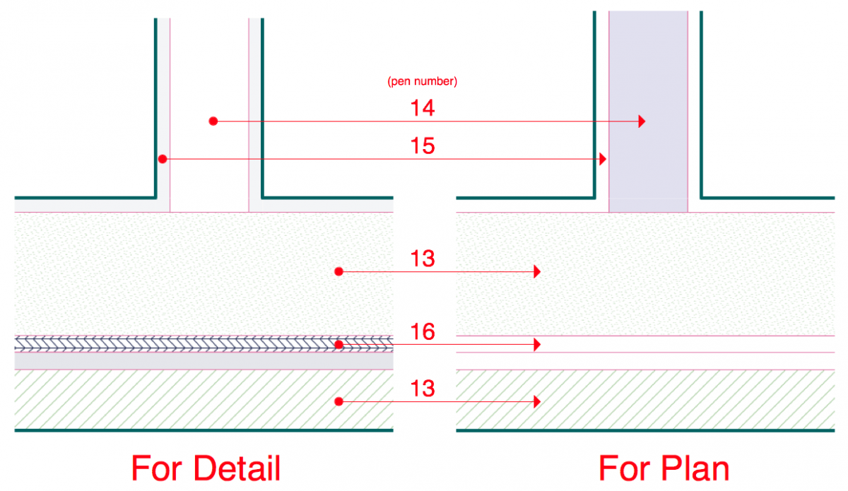
Okay so why do I have four pens for fill foreground colors? It’s all about graphics. It has nothing to do with what the elements really are. Here’s what each pen number is for:
- Pen 13 is used for fills that are always displayed in every view (plan, section, and enlarged views).
- Pen 14 is used for fills that only show up on plans.
- Pen 15 is used for fills that show up everywhere but plans.
- Pen 16 is used for fills that show up only on enlarged detail views.
Here’s an example of how the pens change visibility from plan to detail:
Why is this important and why does this matter now more than ever? Building Materials of course. For proper visibility of Building Materials in all views we need to be able to selectively turn on and off their fills. Maybe in a future version of Archicad we’ll have the option to pick different fills for section and plan, or to be able to control each BMat’s fill based on scale, but not yet. (how cool would that be!) Anyways without creative use of pen numbers we either have to accept an over abundance of hatches in 1/4″ views, a dearth of hatches in other views, or a lot of 2D patching. And this is 2014. We should be just about done with 2D patching. So Pen Sets become the answer.
Once again, just like I describe in Intelligent Dumbing the goal with Pen Sets is to allow you to parse your data to suit the needs of the view/viewer. Embed as much data as possible into the elements (and ideally Attributes) and then figure out the best way to only display what is important for that view. The more we push towards global data for data that should be global (sorry about that bit of tautology), the faster and deeper we’ll be able to design with Archicad. Dump as much reality into the digital approximations as possible and then use your graphic (and meta) data to highlight, describe, and hide that information as required. Let me say this all in another way: I use all those fill pens to SUPPORT and ENHANCE the functionality of Building Materials in my model. The more we can lean on Building Materials, the stronger our BIM will be.
Look again at my pens for fills. Here’s what is possible: creating an 1 1/2″ detail based on any part of the model with all the correct hatches automatically created, regardless of what is shown in the plans and sections. Just think for a moment about the implications.
Bonus Thoughts
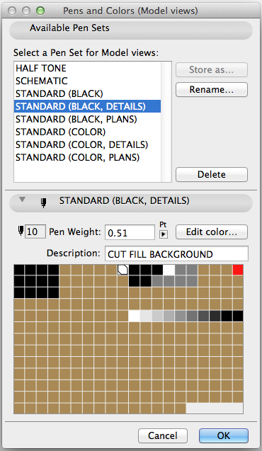
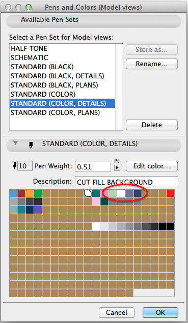
Here’s that same Pen Set from above, but my “all black” version of it.
Compared to my Pen Sets from a few years ago, it’s much more simplified. I’ve done my best to follow my own advice and remove as many pens as possible. There are now fewer pens and they are better grouped. My annotation pens, my “stay black in halftone” pens, and my miscellaneous detail pens are all grouped and aligned by pen thickness. All my sectional pens (10-16) and miscellaneous pens (31-36) are grouped as well. And if you are really eagle eyed you’ll notice that this version of my standard black pen set doesn’t factor in the decisions from this post. But that is the beauty of a smart Pen Set strategy. It’s easily adaptable for various output decisions. If I find that all toned sections are a mistake, it’ll be easy for me to globally revert to this version of my pen set by just tweaking pens 10, 14, and 16 (which by the way could be done even faster via an .aat file and the Attribute Manager).
Pretty cool, huh? Imagine learning that you need to remove all tone from a set of drawings. Imagine being able to say “oh, no problem. That’ll just take me like five minutes. Oh wait. Actually I already made that fix while we were talking just now.” Smart pens, never setting a View’s Pen Set to ‘Custom’ and a respect for global data makes that a reality.
Try it yourself
Curious how this all really works? Jump over to my blog and download my template. Once you open it up you can look at all my Pen Sets, place some elements (I suggest composite walls), and see how the elements change their appearance depending on the chosen Pen Set.
Are you following GRAPHISOFT North America on Twitter? Click Here to keep track of all the latest Archicad News in North America (and beyond). Do you have a question about Pen Sets? PLEASE ask me in the comments. I’d love to write a whole bunch of follow up posts on Pen Sets. I’ll even try to write them sooner than 2017.
You might also like:

More Articles:
Archicad
Customer Stories
Education
Industry News
Tips, Resources + Downloads
Webinar Recordings